
This week, I am using ArcGIS again to create a choropleth map for an audience of my choice. Choropleth maps are the most common type of quantitative thematic map and best display normalized data across spatial units.
In my case, my map's purpose is:
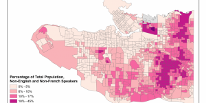
- To show the percentage of the total population that speaks neither English nor French in Vancouver's dissemination areas (DA)
- For the target audience of an immigration services centre which offers free English and French language classes and is looking to set up a new location
By using Canadian Census 2011 data, I have normalized the population of non-English and non-French speakers to the total population, thus showing the proportion of residents who do not speak Canada's official languages within each DA unit.
Which Classification?
As shown in my previous assignment from last term, different classification schemes can drastically change how you data is visualized and understood. There is not universal perfect classification scheme, and depending on the purpose and distribution of your data, whether it is uniform and values are similar or if there are outlier values that are way larger or smaller than the rest of your values, you will have to choose a classification type that most effectively shows your specific data.
I used the natural breaks (Jenks) classification scheme with 5 classes because it best shows the neighbourhoods with more people that know neither English nor French in the darker colors and the pattern would be easily understood by the immigration service center so they can choose an area to locate their new services. As well, because there are extreme outliers in the data, the intervals in the natural breaks classification are less dramatic. For example, if I were to use the quantiles classification scheme, my darkest color would show a huge range of 13% to 80% non-English and non-French population, which would be misleading for my audience.
Here are some skills I picked up through this week’s project:
- Created a choropleth map of non-English and non-French speakers in Vancouver on ArcGIS using Canadian Census 2011 data
- Applied sound judgement in deciding on an appropriate classification scheme that suits the distribution of data and audience of map